Genel Energy Website
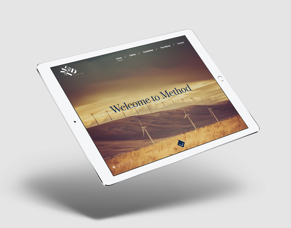
The brief for this project was to refresh and update the existing Genel Energy website to better reflect the company ethos and be more user friendly in terms of content and layout/usability. A four column grid was devised with the idea of being responsive for smaller devices. Character was brought in through the use of subtle Turkish symbols behind imagery and as background elements. These are the pitch visuals, when the site was built, some further development was applied.


